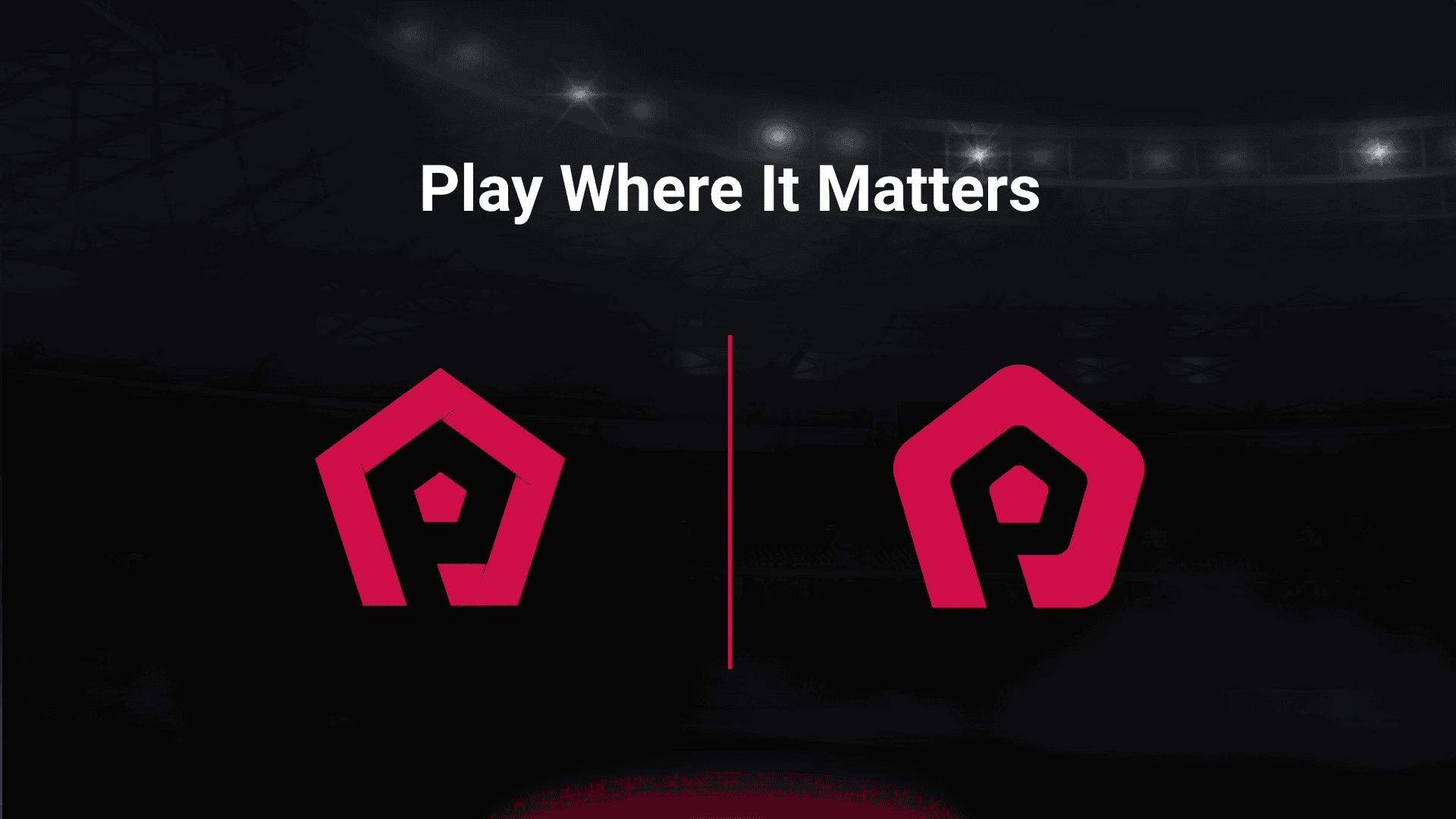
The ProLeague has a new logo!

Perhaps you have already noticed it in some places, such as Discord: the ProLeague has a new logo! This is not about major changes, but about perfecting the details. With this, the league emphasizes its development into a modern, unified brand that can be used consistently across all levels of the organization and in all competitions. The redesign brings both visual clarity and contemporary digital applicability.
Origin and components of the previous logo
The previous ProLeague logo was based on a pentagon, a five-sided shape that symbolized the connection to traditional football. In the past, footballs were sewn together from leather patches, which often had pentagonal shapes. The typography of the logo remains unchanged. The designer font emphasized the word parts “Pro” and “League” with different font styles to visually separate them. The negative space between the two pentagonal elements formed the letter “P,” serving as a symbolic representation of the ProLeague. The shadowing at the corners of the pentagon was intended to give the logo additional depth and expression.
Goals and changes of the new logo
The main goal of the redesign was to create a unified logo that can be used consistently in all countries and competitions. Shadows and color gradients, as used in the past, reduce readability, make reproduction on different materials more difficult, and increase production costs. The new logos are therefore clearer, simpler, and more versatile. They remain easily recognizable at both large and small scales and combine text and pictogram more balanced than before.
Rounded corners give the logo a softer and more inviting aesthetic. This style corresponds to current design trends and unites functionality and beauty. The logo is thus optimally adapted to the digital environment and meets the requirements of today’s users.
National competitions and color design
All national competitions within the ProLeague receive their own logo. Here, the small pentagon in the center of the logo is replaced by the respective national flag. The ProLeague color is retained for the overall organization. In this way, the identity of the league as a whole is preserved while the national individuality of the competitions is simultaneously visible.
Conclusion
With the new logo, the ProLeague creates a contemporary, clear, and unified appearance. The adjustments improve readability, reproducibility, and the visual impact of the brand across all platforms. At the same time, the connection to the tradition of football is maintained. The new logo is a step toward making the ProLeague a more modern, digital, and international platform even more visible, and thus part of the journey the ProLeague has begun in recent months.